
The secret design psychology of book covers

Does the old adage, ‘Never judge a book by its cover’ still hold firm when that’s exactly what you’re supposed to do?
Over the past few years, I (Meg) have been quietly stalking the darkened corners of bookshops, watching and appraising the shifting trends in book jackets and cover designs - noting the not-so-subtle psychological manipulations at play by publishers.

“I ain’t got time to e-read.” - The Predator
Why great book covers matter
The world of paper publishing is a tricky beast. After throttling the threat of e-books and Kindles, the heat is always on to justify why paper books are so much more popular - and one avenue is through beautiful covers.
Writers, agents and publishing houses need Twitter, Instagram and Facebook as a marketing tool. As a visual medium, these channels practically beg you to upload your most likeable, clickable, shareable images - so a phenomenal book jacket is critical.
Delve into the world of #booktwitter or #bookstagram and submerge yourself in a world of stunning designs and countless 😍 🔥 emojis wherever you turn. Book lovers are passionate people, and publishers need them to get excited, share social posts, write a blog, ask for a proof copy - so the covers need to work hard!
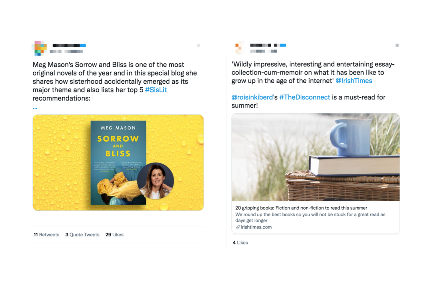
Consider these 2 examples of marketing a book via social media. Which one of these makes you want to read the book?
The origins of book jacket design
Some of us dream of an old, mahogany-cladded drawing room with shelves of classic books and the heavy fug of cedarwood and brandy - but take another look at those shelves.

You’re probably picturing spines wrapped in burgundy, forest green, leather brown, with minimal text - gold lettering, if any - and a pleasing tonal consistency.
And now picture yourself in your local charity shop and cast your mind’s eye over the faded, tatty covers from roughly 1950-now. There was a long and dreadful period when magnolia was in vogue, and the covers were almost ashamed to be loud or proud.
But back then, we actually read a lot of books. It didn’t matter what books looked like, because we were reasonably likely to pick them up anyway - another beige block on our shelf, but who cares, because it’s the story that matters.
While that’s still true, the number of books we read globally has dropped catastrophically. Blame iPhones, blame tablets, TV, Nintendo, XBOX, decreasing literacy levels … whatever it is, publishers know we aren’t reading a lot so the books have to compel and entice us in the quickest of glances.
This is often why Penguin, and other publishing houses, ‘rebrand’ the classics in the hopes that fresh, relevant designs will pull us back.
Here are a few of the design covers given to George Orwell’s 1984 over the years. I love that as the book becomes a global phenomenon, there’s no need to spell out what it’s about - the design can afford to become more playful and abstract:
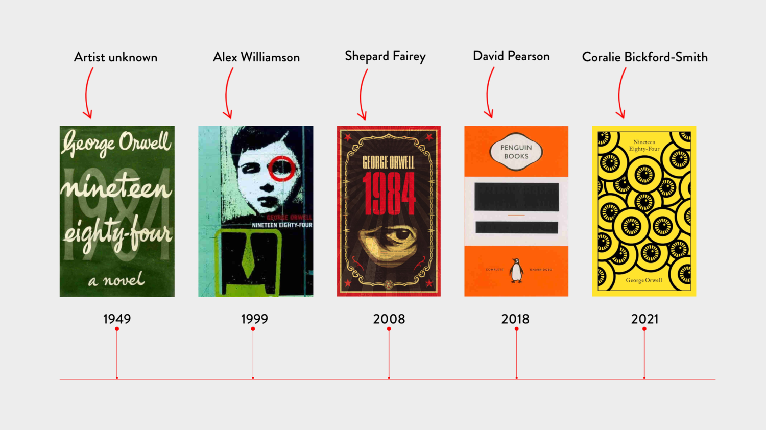
Ask yourself: if you’d never picked up 1984 to read before, which of the covers above would make you give in and buy it? The old … or the new?
For a full list of 1984 covers over the years, check this great list from Print Magazine.
How to maximise book sales? Go for pleasing design consistency
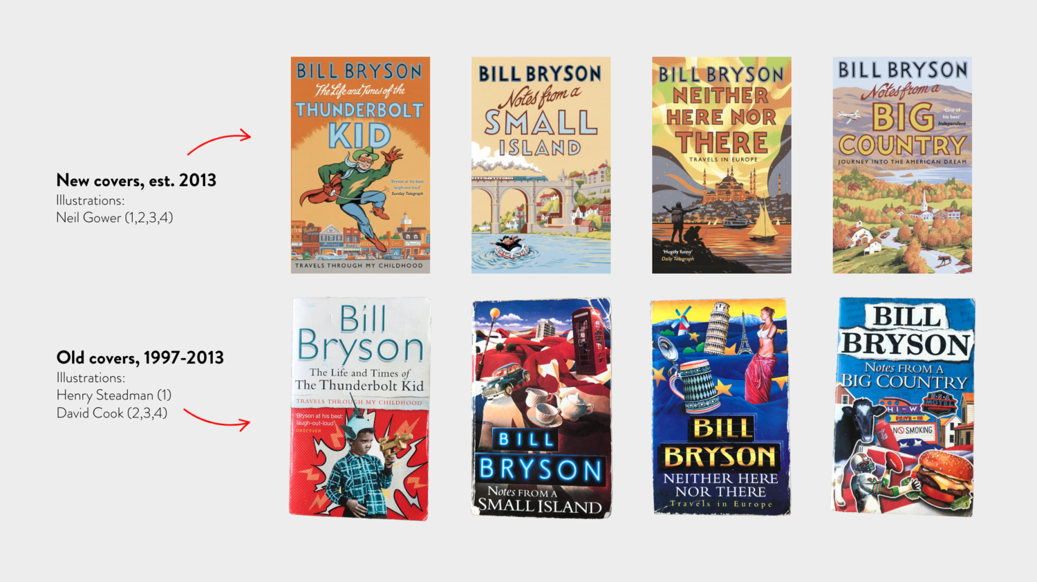
Take Bill Bryson, writer of my favourite books and a name I’ll shoehorn into any conversation. His initial releases - before he became a staple of bookshelves across the globe - still had some illustrative design consistency across many of them, courtesy of illustrator David Cook.
Fast forward to worldwide popularity, and Bryson teamed up with illustrator Neil Gower (who had already produced many of his inside illustrations) to produce a suite of book designs that looked aesthetically pleasing together, with a bespoke design style reserved for Bill alone.
The covers - previously with a mix of fonts, spine designs and colours - now feature the same typography, layout and muted pastel palettes.
One reason why this works well is because for those of us who like pretty bookshelves - the hashtag #bookshelf has 6.5m posts on Instagram and counting, for example - can buy the whole set of covers in one go and donate the old copies to friends or charity. We’ll happily spend cash to make our hobby more visually appealing, and because we love books.

@a_g_parker, Instagram
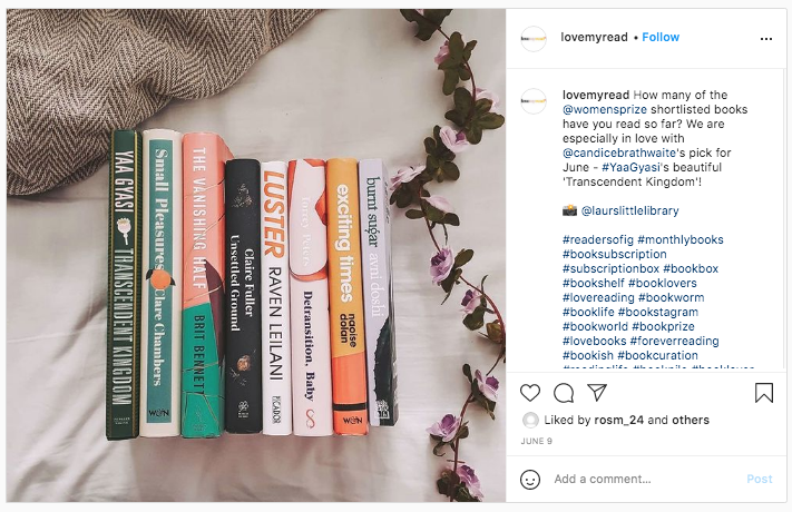
@LoveMyRead, Instagram
Other writers given the ‘full suite’ treatment include Margaret Atwood, Louise Candlish, Liane Moriarty, Ann Cleeves and more. And these are writers publishing now - there’s no retroactive design needed here! Often, when a writer secures a multi-book deal and the publishers feel it’s destined for success, they’ll bring in a designer or design team to style the author’s ‘brand identity’ from the get-go.
Repetition is rife - but there’s a reason why
The world of books is still crudely demarcated by who you are and what you read, and sometimes publishers manipulate this with what I’d call ‘duping’.
By showing you a book cover that, at first glance, looks remarkably similar to another, previous bestseller, they hope you’ll pick it up for a closer look. Once you’ve got it in your hand, that’s Achievement Level 1: Unlocked. The next is for you to read the blurb, flick through a few pages, shrug, and put it in your basket.
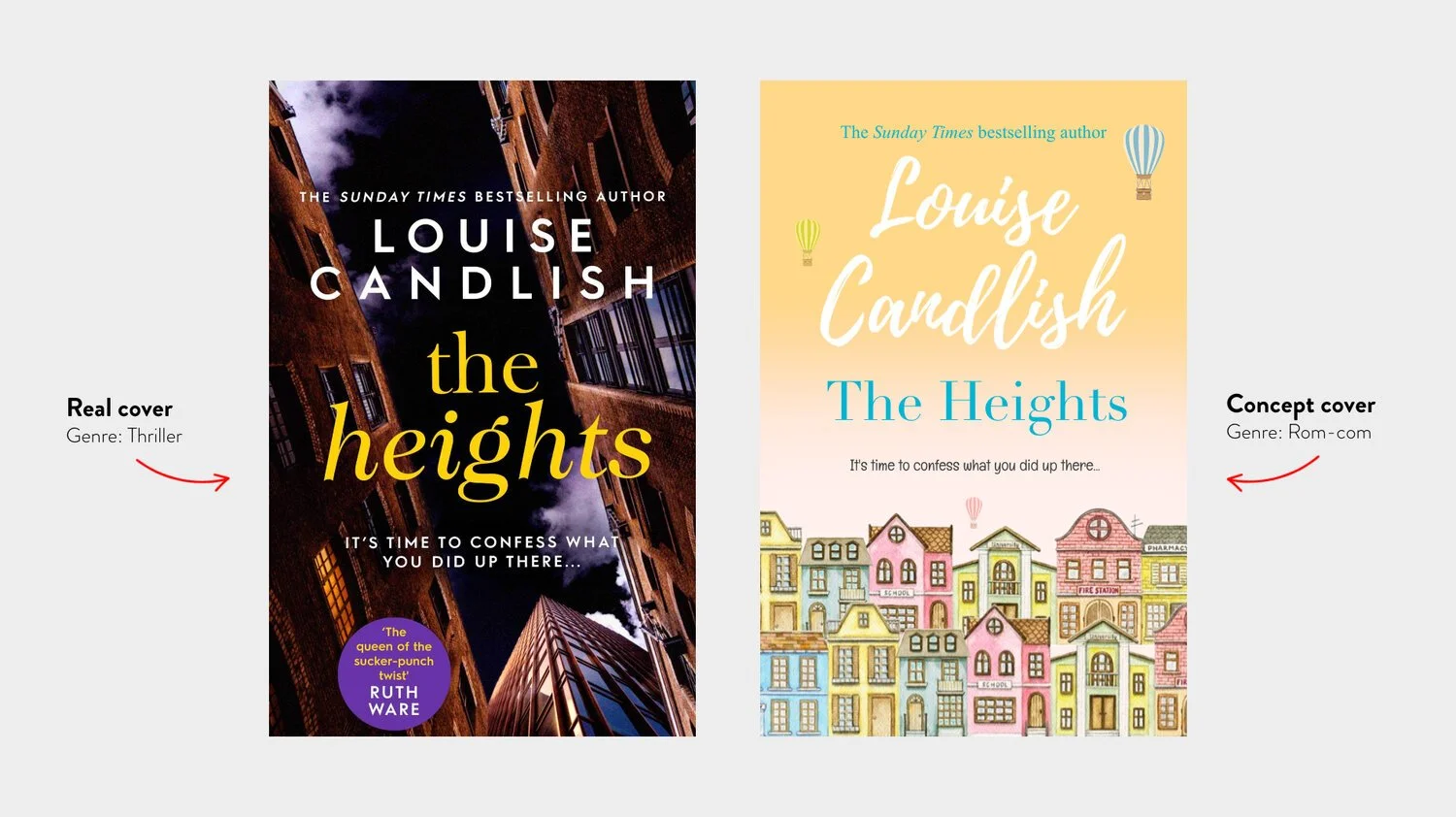
Another reason publishers create similar cover styles is because, within a certain genre, readers have certain expectations. The covers for crime and thriller books, for example, will almost always be exclusively dark and moody, with a single object, scene or person as the focal point.
You’ll often see architectural designs - houses, skylines, train tracks etc - and limited use of colour, reserved for the title or author’s name alone.
Here we’ve reimagined Louise Candlish’s latest thriller, The Heights, as it might look if it were a quirky rom-com (below).
Everything - the fonts, the colours, the artwork - has to be drastically different so the reader knows what they’re buying - even if they didn’t read the blurb.
And sometimes it’s the illustrator who becomes the star. When Raynor Winn published her break-out bestseller The Salt Path in 2018, the incredibly talented Angela Harding was the talent behind the cover.
3 years later, when Patrick Barkham published his book The Wild Isles, the cover looked strikingly familiar - because Angela Harding had been commissioned to illustrate it (below).
Thanks to Harding’s unique design style, Barkham’s new book looks very different to all his others - but very similar to Raynor Winn’s.
The psychology at play here means that I - a reader who enjoyed Winn’s book a lot - will now feel more inclined to pick up Barkham’s book, on the measure that there must be a similar level of quality and type between them.

Spot the similarities between the last two ↑
Linocut style illustrations
Similar bird breeds
A secondary animal is featured (dolphin and deer)
Same colour palettes (pale blue, yellows, murky greens)
Both split into different ‘planes’ with elements in the top, middle and bottom sections
Now here’s an interesting example that shows what happens when a less-popular genre goes mainstream. When Jessie Burton released the worldwide phenomenon, The Miniaturist, in 2014, and followed it up with The Muse, she brought historical fiction to beach bags and holiday suitcases.
Since then, capitalising on the success and hoping to emulate her sales figures, new books from other genres have taken inspiration from her cover designs. Publishers hope you’ll associate this new book with the established quality you already know (below).
The detailed embroidery-style graphics, serif fonts, rich jewel tones and focal illustration are consistent.

Here’s another great example of repetition in book jacket design. Spawned in the era of Instagram self-love gurus and the celebration of ‘messy women’ (looking at you, Fleabag), book jackets for ‘raw and honest’ female authors are taking notes from each other.
These are a few covers from Dolly Alderton, Charly Cox, Nell Frizzell, Natasha Lunn, Emilie Pine, Maggie O’Farrell, Holly Bourne and Florence Given:
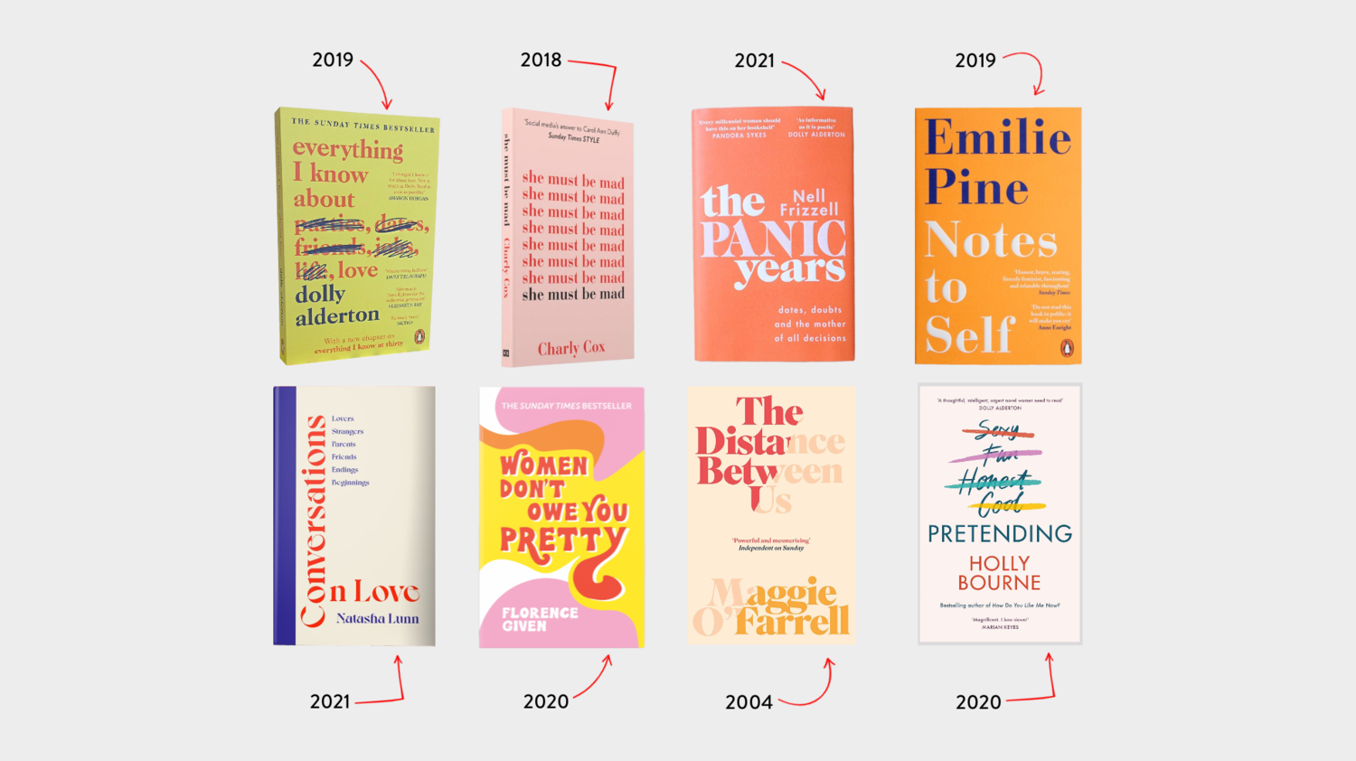
All the covers feature minimal typographical design and a clever use of negative space. No imagery at all. All of it is meticulously designed to make you identify with these modern-day, flat-sharing, Deliveroo-ordering millennial women (no shade intended - that’s literally me).
Note: The outlier here is Maggie O’Farrell (an arguably more established author whose books have been published since 2000) - but the similarities remain! Originally published in 2004 with a much more traditional cover, The Distance Between Us has since been given a fresh update, as seen above - presumably to better compete with the new raft of cover designs given to these popular female authors.
Final thoughts
There are always exceptions to every rule, and no doubt you could easily find book covers breaking the rules all over the place - but next time you’re wandering in Waterstones or, even better, your local bookshop, take a second glance at the shelves and you’ll start to notice all the hidden psychology at play…
But whatever floats your boat regarding cover design, just remember - it’s what’s inside that counts.
We hope you enjoyed The Secret Design Psychology of Book Covers! This is my exploration of a subject I love, featuring my opinions only. If you’re an author or publisher reading this, please don’t sue us 😇